The first thing a user sees after going to a website or program is an interface: various buttons, fields, menu, sidebars, etc. Almost at this moment, an attitude to what a user has seen is formed in his or her head and the attitude to a web product is based on this.
As we know, the web designers and template designer, who search for the ways to create an original product with an intuitively clear structure, are always working on website’s design. Designers develop the design and template designer brings the ideas and concepts to life.
You may think: what can be hard in this: one person is drawing and the second writes a code. And what is the sense of this testing?
The Logic of Layout Testing
If a prototype of a future website is drawn to the tiniest details, we will finally get a planned project with a visually correct structure! But there is always one point: a web page must not just reflect a created design but allow to comfortably interfere with it.
And here appears the process of layout testing which can be divided into several parts:
- Testing of the visual part;
- Cross-browser and cross-platform testing of a website.
So here is the question: is it important to test the visual part of the website? Since it’s not a software and not even a security block.
Why layout designer can’t compare by himself or herself the design with the mock-up he or she made? Of course, he can!
But it’s the sense of testing to search for details. Also, don’t forget about human factor: any layout designer, even the most skillful, can lack the objectivity while working.
How to Properly Test the Display of Web Pages?
Every member of the QA department must have a huge set of additional tools, criteria and style guides (special instructions for common buttons and captions on the websites). They will help you to completely and as quickly as possibly test the product.
So, first of all, check the visual interface of a page. Primarily you should compare it with the mock-up.
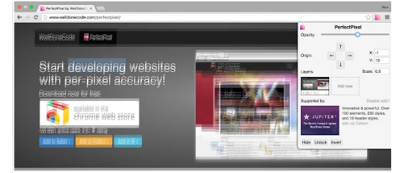
All blocks on the website must overlap with the design and the text fields must have a gap, not more than 5 pixels. A special extension PerfectPixel is right for such things: you just need to shift translucent mockup of the website with the final mock-up – and you will see if there are any differences.

PerfectPixel
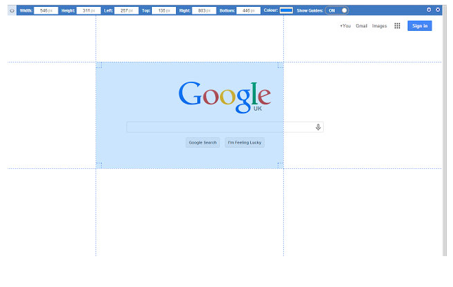
If besides mock-up, you have also a page grid, you can utilize simple but quite efficient extension for browsers – Page Ruler: graphical ruler will help you to measure the whole page and also a separate element or a group of elements.

Page Ruler
After testing the general display of the image, you can move to details.
The program WhatFont will help you check the correctness of a font and Color Zilla will help to check the variety of colors on the website. Spell Checker or Artemy Lebedev’s Orthograph will help to check if text blocks have no spelling mistakes.
Testing a Page Adaptability
A simple window of a browser is the best tool for such testing. You can just decrease the width or the height of a window and see how the arrangement of blocks is changed.
If you notice a horizontal scroll or a group of elements doesn’t fit in visible part of a page, there are some problems with a layout which need to be corrected.
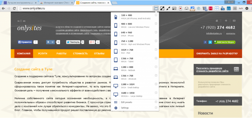
If you want to perform this testing with the help of a program, then pay attention to Windows Resizer extension. This extension offers numerous sizes of desktop, laptop and smartphone windows.
You can also add necessary proportions yourself or delete unnecessary configurations in the settings menu.

Windows Resizer
Also, we must point out that any text on a page may look very small or very big and a user may have vision problems. In order to solve such issues, most modern browsers have a function of zooming the screen.
Of course, desktop zoom changes not so often but mobile devices allow clients to continuously increase/decrease a dialogue box, so don’t forget about testing a mobile zooming.
Visually check the correct display of all available navigation elements:
- Is there a cursor on all clickable elements?
- Its absence on non-clickable elements;
- The appearance of a cursor and a possibility to enter the characters for entering the text;
- Display of a favicon.
Cross-Browser Testing
The same page can look absolutely different in browsers. First of all, it’s because of special engines programmed in the browser. Testing the layout, you must obligatory check the display of the pages at least on the most popular browsers. Usually, the display of an image does not differ much in popular browsers, except well-known IE.
The screenshot shows the difference of the same login form of a Facebook in the version from 8 to 11 IE.

Login Form of a Facebook in the Version from 8 to 11 IE
And now we will highlight three most used and popular services which will help you to test a visual design of a website.

Cross-Browser Testing
Browsershots
It’s a simple but quite popular tool which has a good technical set of settings and parameters. This utility will allow creating a screenshot which will show how your website will look like with particular resolution.
Browsershots system has many built-in modern browsers of different versions where you can manually choose the size of a screen, color depth, turning on or off Javascript, Java and even Flash.
Unfortunately, a free version doesn’t have a possibility to automate the process of testing, so you need to manually choose all necessary testing. But, nevertheless, Browsershots is really popular and you can use it to thoroughly check a project before it’s delivered to a client.
Browsera
It’s a multi-functional (paid) platform which completely justifies the means spent on it. Browsera will help you to test not only the mock-up cross-platformism but also the functioning of connected scripts in different situations, dynamic display of the web pages, the level of website security.
You can choose 30-day free version and paid functionality with a huge set of parameters and options.
BrowserStack
BrowserStack can be regarded as a leading tool for efficient cross-browser testing. Its functionality has all available real devices+possibility of layout testing in more than 700 browsers.
It has functions of testing directly from a local PC or making a set of screenshots of a tested page (up to 25 screenshots). Free tariff plan has limited time for testing and paid plans offer the levels of functional availability depending on the price of a project.
Moving On
Can we say that we have completed testing? No!
Now our task is to check all links which reflect the logic of a website or can lead to a well-known 404 page.
A simple hyperlink to a website content can be outdated or change but we must certainly know that it works in the moment of a release. We use Black Widow application for this.
Periodically running the program, we can find a list of broken links before a user will find them and can give them to developers to solve the issue.
Also, we must also remember that any web page must meet the followings standards:
- Obligatory coding in UTF-8 format;
- HTML standard;
- CSS standard.
The first point is easily checked with the help of F 12 button (Elements – for Chrome browsers).
And https://www.w3.org service can be used to check the correctness of HTML and CSS code. You just need to write the name of a website or particular country and start checking.
Everything that needs to be fixed will be highlighted with a word ERROR.
Additional Testing Set
If the time limit of a project allows to test it more thoroughly, analyzing a program code, you can test the functioning of some more parameters (in case if they are really needed for creating such a website):
- Web analytics (Yandex metrics, google analytics). You can check the presence of a counter itself and functioning of ID counter.
- SEO. We are interested in such a thing as tags. Every website page which is indexed by a search bot must have «keywords» and «description» tags. And the paged closed for indexation must have “noindex” tag;
- Compatibility with social networks. To check the functioning of reposts, likes and response chasing, developers write a special method in a program code. The task of a member of the QA department – to find this method and test its functionality. For example, the visual design of sharing buttons must be easily recognized and be visually different from other elements of social networks. Another task is to check the correctness of information of a group or a user when we upload it in a chosen social network (a post must look like a post and an image must look like an image).
We shortly overviewed all the importance of layout testing and also some methods of such testing (the logic of actions). They all – simple and a little bit hard – will be very useful for web application testing services and will allow creating a useful product.


Leave A Comment