As it’s known, electronic commerce is a special sphere of the modern economy, which consists of financial and trade operations, executed via computer networks as well as business processes, inextricably connected with such operations.
It (e-commerce) is aimed to help to sell goods and services through the global network. Websites, which do these processes, differ by lots of peculiarities/features, that classify them by their direct function/aim.
Their basic features are:
- Fully developed personal cabinet (personal data, transaction history, state of new and old orders, payment data and info about delivery, loyalty program, sales, and various bonuses);
- Connection mechanism to payment systems;
- Integration with the services of delivery agents;
- A function of managing the discounts and different extra charges on products, the creation of various kinds of goods for different types of customers; settlement of discounts after reaching some price for the product, making discount coupons;
- Integration with platforms of inventory management.
A real e-commerce platform is a constantly developing project, authors of which are headed to forward-moving only. It means, functionality and parameters of online store are constantly edited and new technical opportunities are added. External displaying of such websites can be changed in some time, but their basic structure and functionality stay the same.
Further, we’ll analyze basic functional blocks and widgets, which should be in every online store.
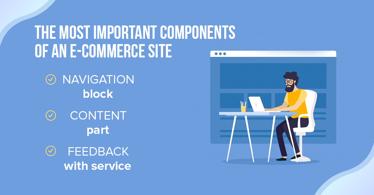
Important components of an e-commerce site
Breadcrumb trail links
Navigation chain or “breadcrumb” is a very important factor of visual convenience of interaction with any modern website because it shows the user where exactly he/she is. It also allows the client to quickly return to the page of a higher level, when “traveling” through website pages goes farthest, no matter what page was opened firstly. Also, we shouldn’t forget, that “breadcrumb” is very useful for SEO because it allows searching robots to quickly define the current site architecture.
Using such benchmarking allows displaying the information in the form of navigation chain in search results instead of traditional URL-requests – where there’s a trivial demonstration of link name on the “breadcrumb”. Usage of the navigation chain – is a good signal of users reliance, which significantly raises a well-known CTR (Click-Through Rate – illustrator of site clickability).
Product title
Any website client pays his/her attention to the names of goods there anyway. What should it be in theory? A very good and attracting name:
- Doesn’t have an obvious abbreviation, except commonly used acronyms (kg, cm, m);
- Doesn’t include professional concepts and statements, which can be easily changed with traditional names;
- Totally lines up with one traditional formula, which is used exactly in this online store (for example, product type – TV-set, manufacturer – Samsung, item modification number – 435446567);
- Includes important technical data, which helps the client to make a decision (for example, regarding TV-set – it can be putative diagonal or contrast ratio).
The perfect example of an attractive name: Samsung TV 435446567, 27’, Black Matte.
Not so good name: Samsung TV 435446567, 27’, Black – in this case, the color is given in English.
Products rating
The basic purpose of any comment – is an increase of trust from the potential users. A potential customer of some product or service believes more the real comments and opinions of those, who previously tried this product or service, rather than trade advertisements, which are sometimes a banal fairytale, oriented to a quick “selling trusting clients a product”.
Video
A detailed page of the product or service often contains, except the block of images, a demonstrative video, that allows making a client’s perception much easier, seeing the product in action in real time. Moreover, it can be qualitative 3D-video, which allows watching the product from different views.
Thumbnails
Thumbnail is a mini version of an image, which is displayed several times smaller than its original for the maximal perception comfort from the side of the website user. Traditionally, thumbnails are built in slide carousel. With their help, we can retrench a great deal of space while saving site informational content.
Related products
Online store client (while buying a mobile phone, for example), wants to choose matching accessories (glass screen protector, SD card, cases). A potential opportunity to buy a product, completed with some useful accessories, increases the price in the receipt several times. Moreover, the client can see other products, which can be similar to that one, he/she is interested in.
Product information
A detailed description of the product can occupy from 2 to 4 tabs. Such tabs can be with technical information about the product, methods of its usage, info about delivery and payment questions, comments from previous customers as well as with another data according to this product and its features.
Sharing social networks
If you want the customers to buy some product in the online store, firstly you need to make them trust its (product’s) supplier (website). A good addition to the great design, content part and UX can raise the future customer’s belief as well as so-called signals of trust: for example, a chat with the company’s agent, detailed block with the contact info, customer’s comments, pages in the social networks and so on. More than a half of trust signals are aimed to convince the client that this online store is managed by really responsible administrators, that the resource really plays its significant role in the business sphere, and a lot of real customers trust it.
Price
In this block, a couple of prices can be displayed at the same time. For example, there can be an old price and/or price with a discount or a special offer.
Order information
Online store customer has to see all available information about payment methods and product delivery. In such a block, fully meaningful data should be shown.
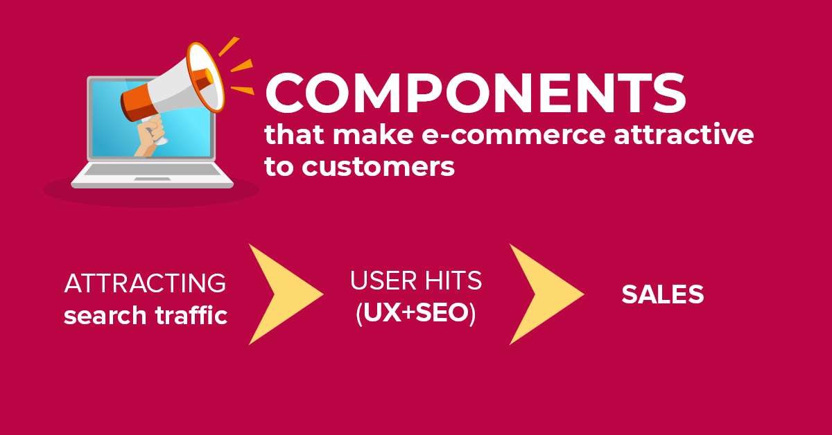
Components that make e-commerce attractive to customers
Options
It can be simple radio buttons, icons or check-boxes, with the help of which, you can see detailed info about one or another product for buying it. For example, when buying a TV such options can be chosen – production year, manufacturer, diagonal size.
The “Add product to cart” button
Sometimes this button can be called as call to action. Call to action (CTА) – is a special call for a user’s action on the web-portal pages. There’re different types of CTА: for example, information button – such call to action is firstly connected with the content on the homepage, with the help of which a client can get more data according to a chosen topic.
Button for customer focusing – such call to action is closely connected with a content part, that allows solving some problems or tasks, which the client faced while interacting with website pages.
From the testing side, the most practical option is “Add to cart” (button of adding the product to the customer cart). The logic of some sites is programmed in such a way that right after pushing the button, the client is redirected to the cart page, where that product is waiting for the payment. But from the usability side – such an approach isn’t correct because the client doesn’t have the opportunity to choose or look at other products. Such a logic should be applied for the button “Buy it now”.
Quantity
With the help of this functionality, the exact amount of goods (that customer wants to buy) can be given. Landmark value in such functionality should be limited by the available quantity of goods in the store. This value mustn’t be negative or zero.
Wishlist
Site customers need to have a real opportunity to add some goods that they liked to the list with their wishes. A special webpage should be created, where these goods will be added. In the future, customers will have a possibility to easily add products to the cart and delete them (goods) from it. Such a functionality opportunity allows clients “remembering virtually” those products that they liked and which may be bought in the future.
Add to compare
Such a function will be really useful when you choose some technical goods. For example, choosing a new TV, a client may want to compare a few models at the same time in order to choose for himself/herself an optimal quality-price combination. In this case, he/she can add several products in comparison and in the convenient form (of a detailed table) examine all previously chosen goods.
Price watch
It’s a very useful function for customers, with the help of which they always can watch the price changes of the products and services that they liked. List of such goods or offers can be filtered by a user directly.
Availability
Such an icon immediately informs the client if the product, he/she wants, is available in the store or not.
Special offers
In this block, an extra group of goods can be displayed with a special discount or accessories set for the current product with favorable terms of purchase.
Reviews
A special link, which allows going directly to the page with previous customers’ comments. With its help, it is possible to value the quality of service and goods/service feature.
Product ID
Such a function will be useful in those online stores, where the trading is based on a subject catalog. Product information, pictures and names can change, so the product ID on particular catalog is the most accurate method to find a certain prooduct model.
Zoom in
It’s very well when there’s an opportunity to zoom a product image and examine all the details. It is a widespread practice when the magnified view is shown in the separate browser’s window.
Product photos
Any picture is memorized better than a text, and most customers on the Internet will run through the goods, looking at their images only. For offered goods, it’s better to use only images of high quality and give a lot of blank space on a detailed webpage. Also, one should think about diversifying the online store functionality with zooming parameters or the opportunity to examine the larger version of the picture.
The default picture has to be the most suitable to the product description (for example, the most common color of this product), as well as the group of additional images should be available in order to cover the different color options.
The “buy it now” button
Logical functionality of “buy it now” button should be fully similar to “buy” button functionality, but right after clicking on it, the website client should be redirected to the buying product page, meanwhile after clicking on “buy” button he/she may continue searches for adding the next goods to the virtual cart.
Every day online shopping becomes more and more popular. The success of any e-commerce website depends on its proper functioning and absence of bugs. That’s why their owners need to maintain QA standards and test the site so it will be attractive for customers and make a profit.


Leave A Comment