
The permanent growth of a number of various mobile devices creates a possibility that more and more users of the net use mobile devices for web browsing (online shopping, viewing necessary information, simple surfing for media content, etc.)
And since the technologies are always developing, new mobile devices immediately substitute the previous ones and such thing as responsive design appears in the web software environment.
Whereas previously, a situation with mobile devices support was solved through a trivial development of a separate mobile version of a website (such as on special subdomain m.mobilesite.com), today such things are performed exactly with the help of responsive design and layout (through the implementation of media query technology inside CSS3 set).
Such data is a combination of special styles which are specially created for extensions of mobile devices with particular parameters of the mobile device. It uses such a principle: if a device has a particular size of a screen which must be performed by a layout designer in the process of creating a site mockup, he or she should use necessary CSS symbols and rules.
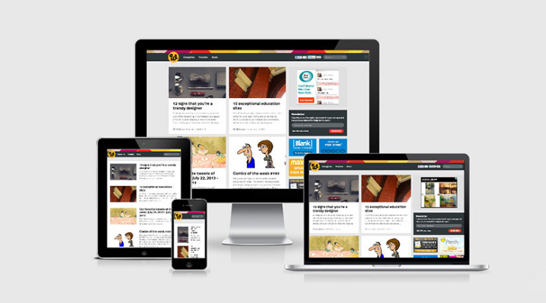
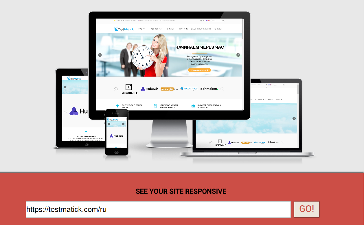
Responsive web design is a special approach to developing original web design, during which appears the orientation for creating comfortably viewed sites and platforms on the basis of using the tools for optimal perception – a trivial reading the text blocks, panning and also scrolling the dynamic blocks on maximum number of mobile devices (from tablets to cellphones).
It seems that everything is very easy and even low-skilled layout designer can manage with the task of creating responsive design by himself or herself but in fact not all front-end developers completely comprehend the sense of requirements of “rubber layout” and it’s the reason why QA specialists always have work in the process of running “fresh-printed” HTML5+CSS3 mockup.
The Problem of Testing Responsive Design
More than a half of Internet users use their mobile devices and tablets as the tools of interaction with the websites, so it’s very important to test the responsive design since sometimes internal interface completely differs from the extension of desktop devices.
Probably, the most difficult part of testing a website according to particular data is that a platform functions in a way as needed for all lists of possible devices but actually the testing is not very efficient for many users.
Responsive Design
Very often testers who have to test the responsive design, start to play with decreasing/adding the size of the used browser in order to adjust a product to the potential size of the mobile device in such a way.
Such method can be certainly used but only for immediate visual analysis of site’s functionality in different extensions. This will help to immediately find basic issues with the displaying of the image when we, in our turn, decrease or increase the size of the window of our browser.
But in this sense, we can say that testing on real mobile devices is an absolutely different experience and “possibilities to perceive” the product in development.
Tools for Testing Responsive Design
Usually, in the process of testing the responsive version by a whole web studio or department of quality assurance company, you have access to numerous mobile devices which can be used for testing the necessary extension in real conditions.
Of course, it’s very good if you have a new iPad or iPod and also numerous Android devices with different extensions.
If you don’t have such a possibility, you must use what you have access to.
Lucky for testers, free online programs and services which simulate the size of mobile devices and which are perfect for testing responsive design were created a long time ago. It’s logical to suppose that each of them has its own advantages and disadvantages. So let’s analyze each of them.
Am I Responsive
The simplest tool to view your website on 4 most popular devices. It’s good that there is no overload in terms of settings and parameters: everything is simple and quite clear.
You can test on such extensions:
- PC – 1600*992 pxls;
- Laptop – 1280*802 pxls;
- Tablet – 768*1024 pxls;
- Cellphone – 320*480 pxls.
It’s good that it has such a possibility to drag “devices” across a desktop and also quickly share a link for a test with your friends.
Am I Responsive
Deviceponsive
It has something similar to Am I Responsive, perhaps, in its simplicity and minimum set of settings for layout testing.
All available extensions are displayed on a page in a row. Mentioned options will help to edit a background and size of a header, move another logo, what is useful for taking a screenshot.
Available devices and mobile extensions:
- 1280*800 – Macbook;
- 768*1024 – iPad;
- 1024*768 – iPad;
- 1024*600– Kindle;
- 320*480 – iPhone;
- 240* 320 – Galaxy;
By the way, in the mode of working with a site, the service puts lines of scrolling on the pages in order to provide the users of PC with comfortable testing of every centimeter of the created layout.
Responsive Test
The same as Deviceponsive, this service allows you to test the sites on numerous real devices in online mode. But in order to waste time on unnecessary extensions, you should choose a group of relevant extensions in a service menu.
A platform has the well-developed logic of zooming, hence there are numerous variations for testing a huge extension on the small one.
It has about 30 various extensions – from a simple desktop screen to “old” Android.
By the way, if you work with the Firefox browser, you can have some problems.
Why? We can’t answer this.
You should write to Support.
Responsive.is
It’s quite similar to the previous tools. But it has its own difference– a set of smooth animation in the process of changing one device to the other and also translucent background which shows a real size of the site but not such field with which you are working now.
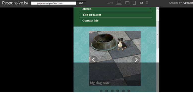
Responsive.is
It has the following extensions: desktop, laptop in portrait and album variations. Unfortunately, you can’t set your own sizes in pixels.
Screenqueries
It is very different from all the tools mentioned before. You can use on the platform up to 14 mobile phones and 12 various laptops in order to completely study the layout.
It has a function of quick switching from portrait mode to the album one and vice versa. All results are displayed on a special net with comfortable rulers which help to immediately measure the necessary proportions and sizes of the blocks, etc.
There are also parameters to mention random extension (you just need to alternately drag lower or right corner of the visible field of the site.)
We should also mention such thing as “Trueview” variation which allows you to look at displaying the website in the native browser of the mobile device (for example, in Safari on iOS).
Screenfly
To our mind, it’s the most efficient and optimal service for testing responsive design.
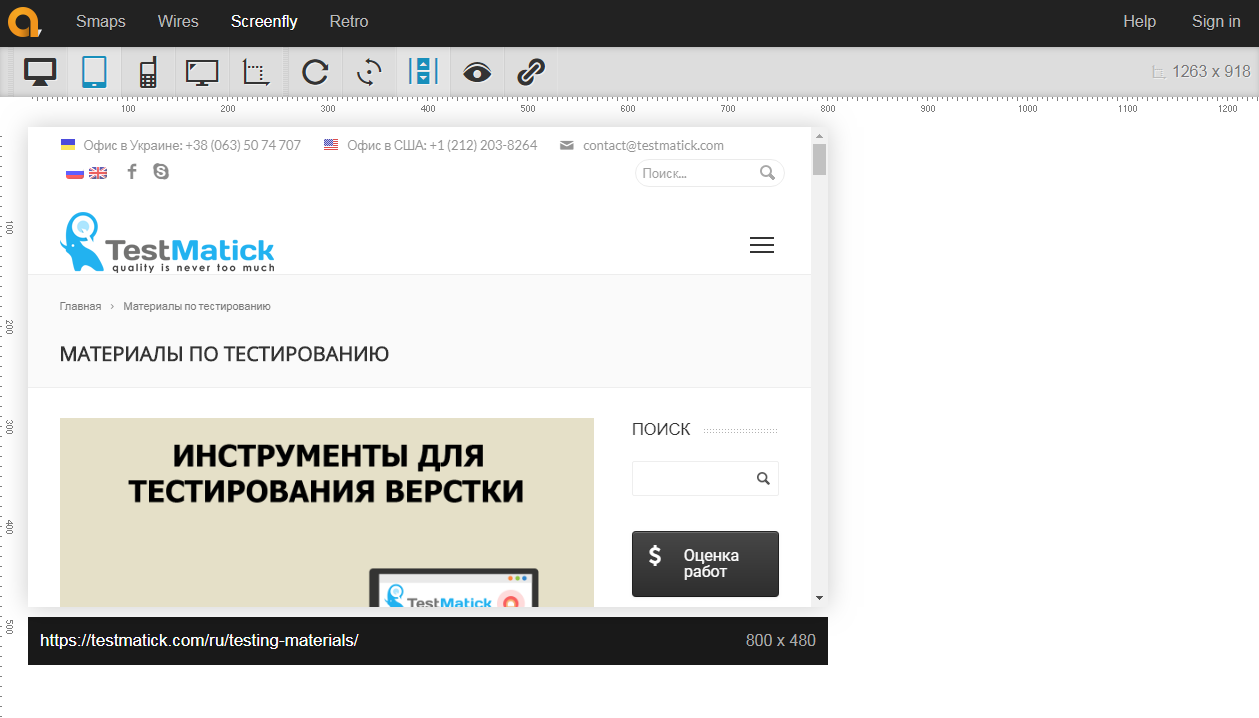
Screenfly
It has up to 9 versions of laptops – from 8-inches to 10-inches screens, 9 smartphones and even 3 extensions from real TVs and of course random size which can be set as you wish. And with the help of just one key, you can quickly share the results of the test with your friends.
The Responsive Calculator
It helps to quickly convert PSD mockup to necessary parts in the process of testing the responsive version of the future site. All you need to do is to choose some actual specifications and alternately transform pixels into necessary values in percentage terms.
Mobitest
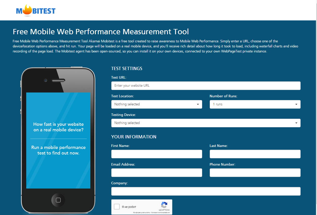
Mobitest
It’s an absolutely free tool which helps to quickly test a mobile performance of any website. You just need to type URL of the site in a necessary field and press the “Start” key.
This page will be quickly loaded and you’ll get a complete report on how much time was spent to load it.
By the way, you should not only study “dry” figures but ask the program to create a report in a form of a chart or media file which can be downloaded to your local computer after the end of the test.
Mobile Emulator from Google Devtools
As we know, Mobile Emulator – it’s a specialized virtual emulator of the necessary website displaying and interaction with a user in a special mobile environment.
Though such tools can’t give 100% correct results, which can be operated in the next tests, they are still the most economically justified solution for quick testing of web product’s functionality on the high level.

Google DevTools
For example, Chrome browser has a special user function which helps to alternately operate various tools for testing and debugging all details appearing in the process of developing the adaptive version of a project.
Google corporation has released special requirements for testing software responsive design, such as:
- Checking for correct displaying of text blocks;
- Optimal zone of object clickability;
- Correspondence of colour and gradient to established values from a design;
- The correctness of corner filling;
- Blocks, images and text must not extend beyond the corners a screen’s visibility;
- Every type of text has its own fonts, sizes and style sheets;
- In the process of scrolling, the text must be correctly displayed, does not float and is justified (only aligning text left – it’s a rule!).
Always check a position of unique modules of the site which can freely function on PC but in mobile extension they may disappear in the non-visible field. This moment may be mentioned in a technical documentation (a checklist to inform QA on what modules must be “caught” in responsive version and to which not pay attention.)
And to conclude…
Always try to check the responsive design of the web product in development. Use a specialized set of automated platforms and services which quickly perform necessary testing and offer accurate data on performed functional testing and will help in future to gain experience in searching for the most usual bugs on the mobile layout.


Leave A Comment