The secret of any good website is how all of its visual elements are placed to each other. This is the basic nature of any layout design.
It is the design that makes the product great-looking. It helps to achieve a balance on all the web pages. When analyzing and developing software design, it is necessary to take into account a whole complex of unspoken requirements that help to make a web product of excellent quality!
So, let’s analyze all the peculiarities of designing layout and mockups in more detail that help to develop websites.

Features of Creating Layout: Nuances of Front-End Testing
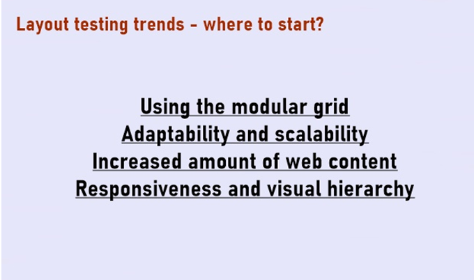
Using the Modular Grid
Using the modular grids allow balancing layout by dividing it into equal parts. The ability to combine multiple columns simultaneously ensures that the content will be interesting and dynamic.
Every year, the popularity of using modular grids is only increasing because, with their help, even novice designers can develop large amounts of graphic information on small web spaces.
Adaptability and Scalability
Today there is a wide variety of mobile gadgets with all sorts of screen options. And specialists should consider many factors when composing content on web pages. This is an important point for all designers, as well as for the testing and development department, who must test and create multi-universal content.
Responsive sites can display content depending on the available options of the web browser.
Modern responsive design trends keep simplicity. Since it (design) is as mobile as possible, users can access all Internet communities on both portable gadgets and desktop screens.
Increased Amount of Web Content
It is logical to assume that any site undergoes some changes over time in terms of styling and graphic content. Its pages are filled with new information, the nature of which should be relevant to the end-user. This means that it is extremely important to develop and test the design in such a way that these activities cannot negatively affect the appearance of the site.
Responsiveness and Visual Hierarchy
When testing layouts, it is worth making sure that the system under test is fully responsive when performing certain manipulations (resizing the screen, deleting/adding blocks, etc.).
The graphical interface should always “talk” with users when their manipulations with it are correct and/or incorrect. Using visual cues or simple messages will help users understand what is happening on the gadget.
The interface of the site you are testing should be designed so that users focus exclusively on the most important points. When creating layouts, you need to consider the spatial relationship between all the elements used on the web page.
This is all done so that the user can surf the page and find that information useful and interesting.
Conclusion
Nowadays Internet contains billions of diverse websites, and their number is steadily growing. This means that testing of such software should be performed with special attention and the complex of all planned checks should contain exhaustive test strategies already at the stage of verification of layouts and design.
It is necessary to understand and be aware of what and how you will test when you get the layout of some web resource when providing software quality assurance services.


0 Comments